Charts
Creating a New Chart
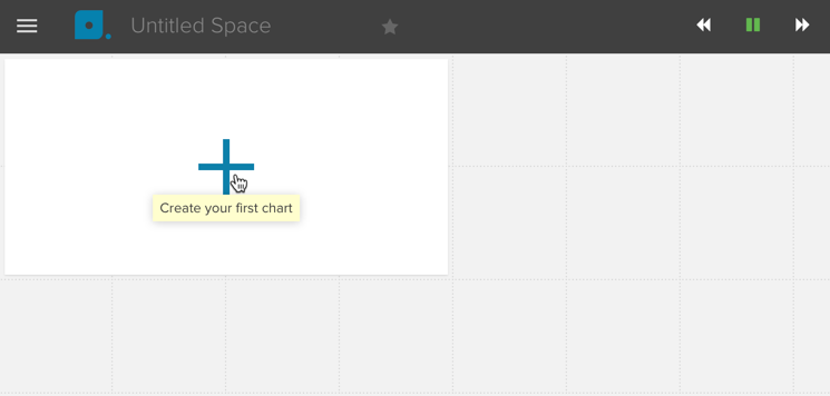
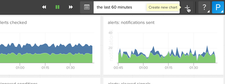
When you start with a new space you’ll see a placeholder for a chart with a large plus in it. To add charts to existing Spaces just click on the plus button in the menu bar.
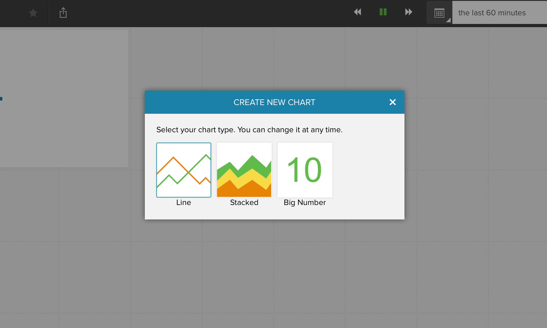
As a next step you choose the chart type. If you can’t decide don’t worry, you can change it later.
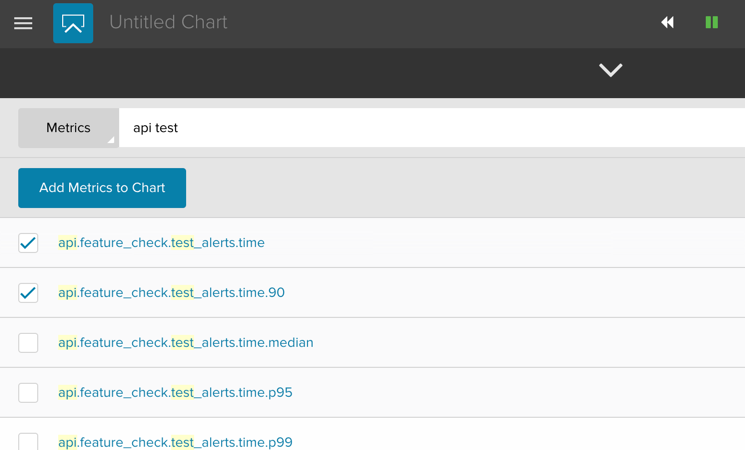
After choosing the type of chart you’d like to create the chart editor will slide up from the bottom of the screen. The chart editor shows you a list of the metrics you’re currently emitting to our API. You can narrow down the list by typing a pattern into the search box. As soon as you start typing the list is filtered.
Adding Metrics to a Chart
Add one or more metrics to the chart by checking them, and clicking the Add Metrics to Chart button.
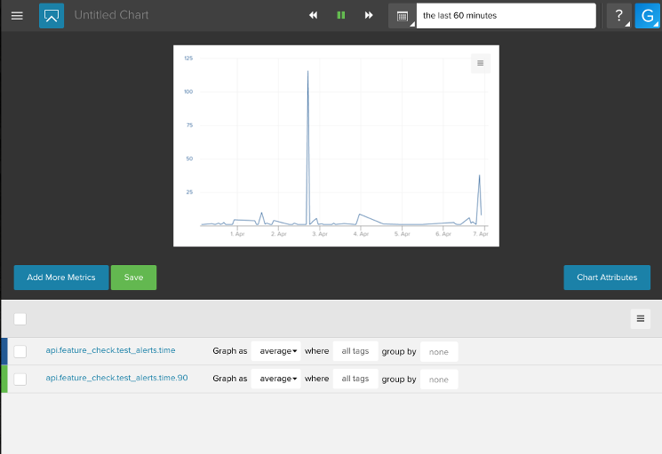
After adding metrics you can see a preview of your chart.
Adding Annotations to a Chart
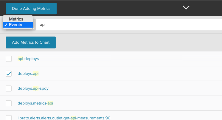
Click on “Add More Metrics” to add more metrics or events. Click on the Metrics button and select Events instead of Metrics to add annotations to your chart.
When you are done adding metrics and events you can name the chart and save it to add it to your Space.
Summarization, Filtering & Grouping aka Stream Composition
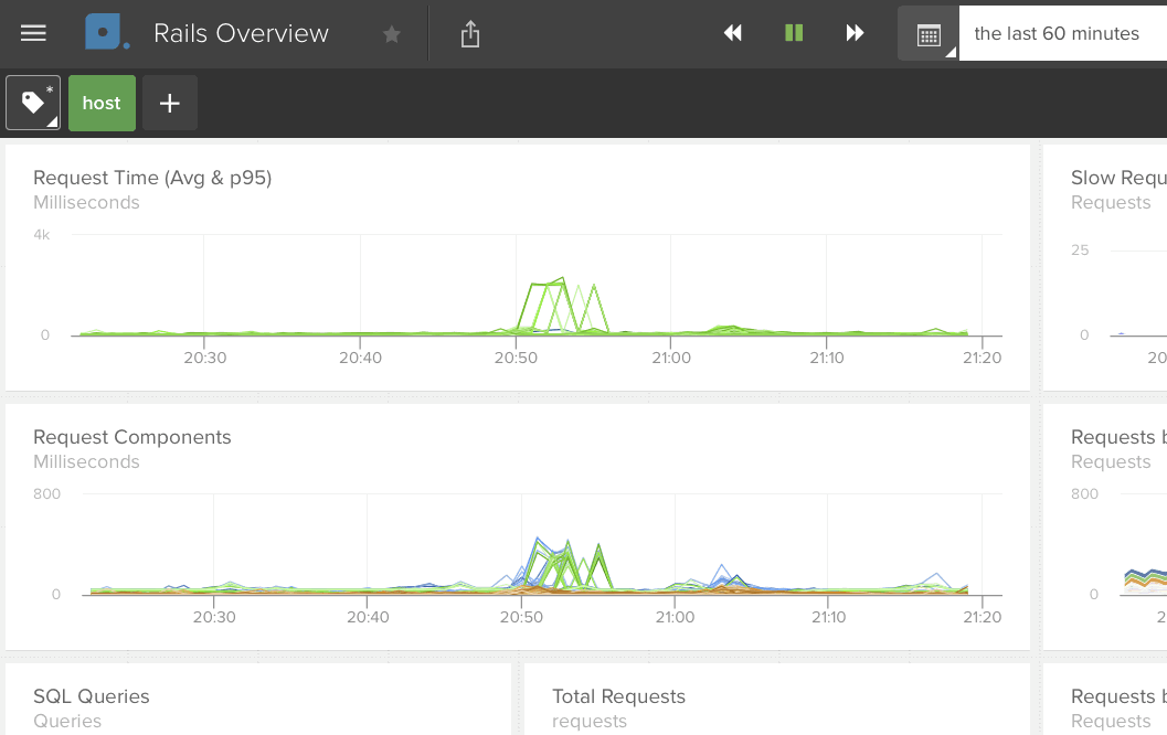
Assuming data exists for the current time-interval displayed by the
chart, you will typically see one line per metric.
Even if you are submitting the CPU Utilization metric for 100 servers, you will only
see a single line because of how the data streams are summarized, filtered, and grouped,
or as how we call it: because of the stream composition. If graph as is set to average
it means that every data point is computed by averaging over each data stream.
To see one line per value for a particular tag, set the grouping function (group by)
to the tag you wish to see the breakout of. Using the CPU Utilization example from above,
if you check the group by check box for the hostname tag, you will see 100 lines,
one for each host.
Summarizing
Graph as defines how your metric data is summarized across data streams as defined by the tag set.
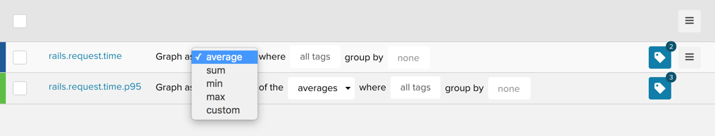
The available options for summarizing across data streams are:
- average
- sum
- min
- max
- custom (opens option to summarize across time)
If you chose the custom option you will be presented with a second field to select how your metric data is summarized across Time.
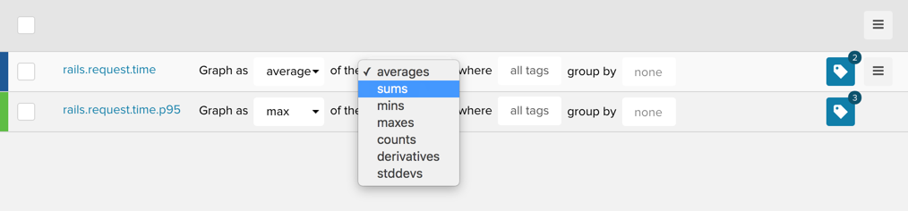
For example, Max of the Maxes will draw a single line for all streams in a specified tag set consisting of the maximum value across all data streams that each return the maximum value in each time interval. This setting overrides the aggregation function defined in the Default Metric Attributes. Options for how you summarize data streams over time (the x-axis) are:
- averages
- sums
- mins
- maxes
- counts (this is the count of measurements in the period)
- derivatives
- stddevs (standard deviations)
Filtering
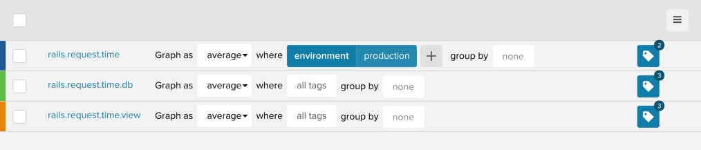
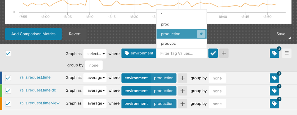
The where paramater allows you to filter the data streams by a tag.
As an example, if you only want to chart the rails.request.time of your production
environment, you can filter the data streams by using the environment tag and
selecting production.
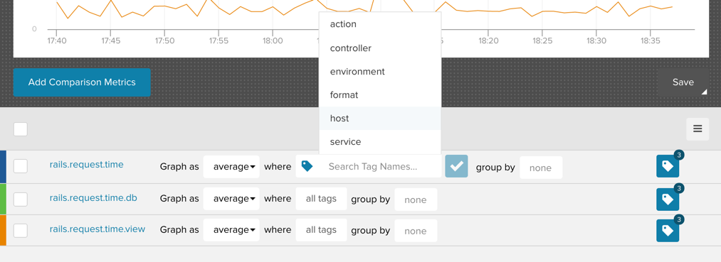
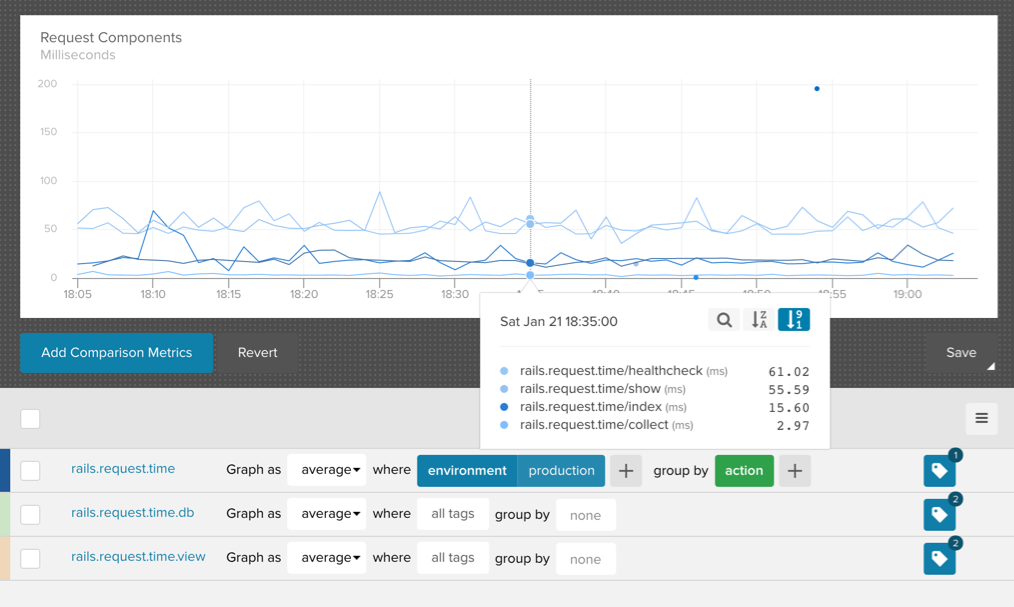
Grouping
The group by parameter allows you to group data streams by unique tag values. In the following
example the data streams are filtered by the environment tag to only show production data and
then grouped by the action tag. This results in one line for each rails.request.time action.
Mass Editing Filters and Tag Sets
You edit the stream composition for each metric individually or by checking multiple metrics and using the mass edit options.
Stream Attributes
Each stream on a chart has a number of attributes you can modify such as the color or whether to use a separate y-axis. To view and modify these attributes, hover over the data stream and a hamburger menu will appear on the far right of the row.
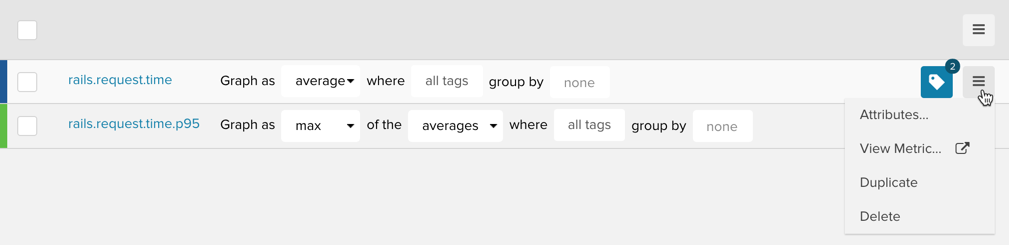
Clicking on “Attributes” in the pull-down menu will bring up a modal:
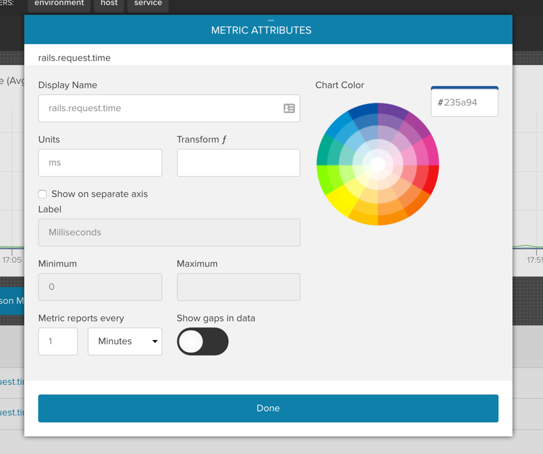
The attributes you can edit are:
- Display Name: Metric name displayed by the tooltip.
- Color: Set the color of your metric either via hex code or the color picker (read more here).
- Units: Units label displayed by the tooltip.
- Transform: Apply a simple formula to the data to, for example,
convert between units like Fahrenheit to Celsius
((x-32)/1.8), or compute rates(x/p). Permitted variables arex(data point) andp(period). Read more about display transforms. - Show on Separate Axis: Check this to set a custom Y-axis label
for this metric.
- Label: Custom name for the y-axis. Every metric in a chart that shares the same y-axis name, shares the same y-axis. Conversely, each metric with a Unique y-axis name creates and uses it’s own y-axis in the chart.
- Minimum: Set the minimum value of the y-axis, e.g. if you only expect positive values you can set this to 0.
- Maximum: Set the maximum value of the y-axis, e.g. if you are tracking a percentage you can set this to 100.
- Metric reports every: Interval at which you are sending us data (otherwise knows as the period). We use this setting along with the Reports Infrequently setting to properly handle gap-detection for your data. If the period is set, gaps will show for periods where no data is received. If it is not set, data points will be connected. Read more in the API docs.
- Show gaps in data: Some metrics are reported opportunistically i.e. every n seconds a measurement is sent only if there is new data. This results in a sparsely populated series. We use this setting in combination with the Period to correctly handle Gap-Detection.
Understanding the Y-axis label, Period, and Reports Infrequently settings are key to your happiness as a customer using Librato. We highly encourage you to read up on these settings and experiment with them until they are friendly and familiar.
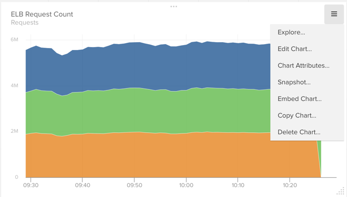
Chart Menu
In the top right hand corner of the chart there’s a menu button that gives you access to chart specific functions. Here you can choose to edit or delete the chart, change the chart type (for example from line chart to stacked chart), take a snapshot, and access the chart attributes.
Explore View
The Explore view is what we call the fire-fighting view. You can either get to it via the menu option or by simply double clicking on a chart.
This view allows you to investigate details of the chart: look at and modify the stream composition, and stream attributes, add other metrics and / or annotations to check for correlations, all the while keeping your original configuration in tact. If you like the changes you make and want to save them, you can either overwrite the existing chart or save it as a new one.
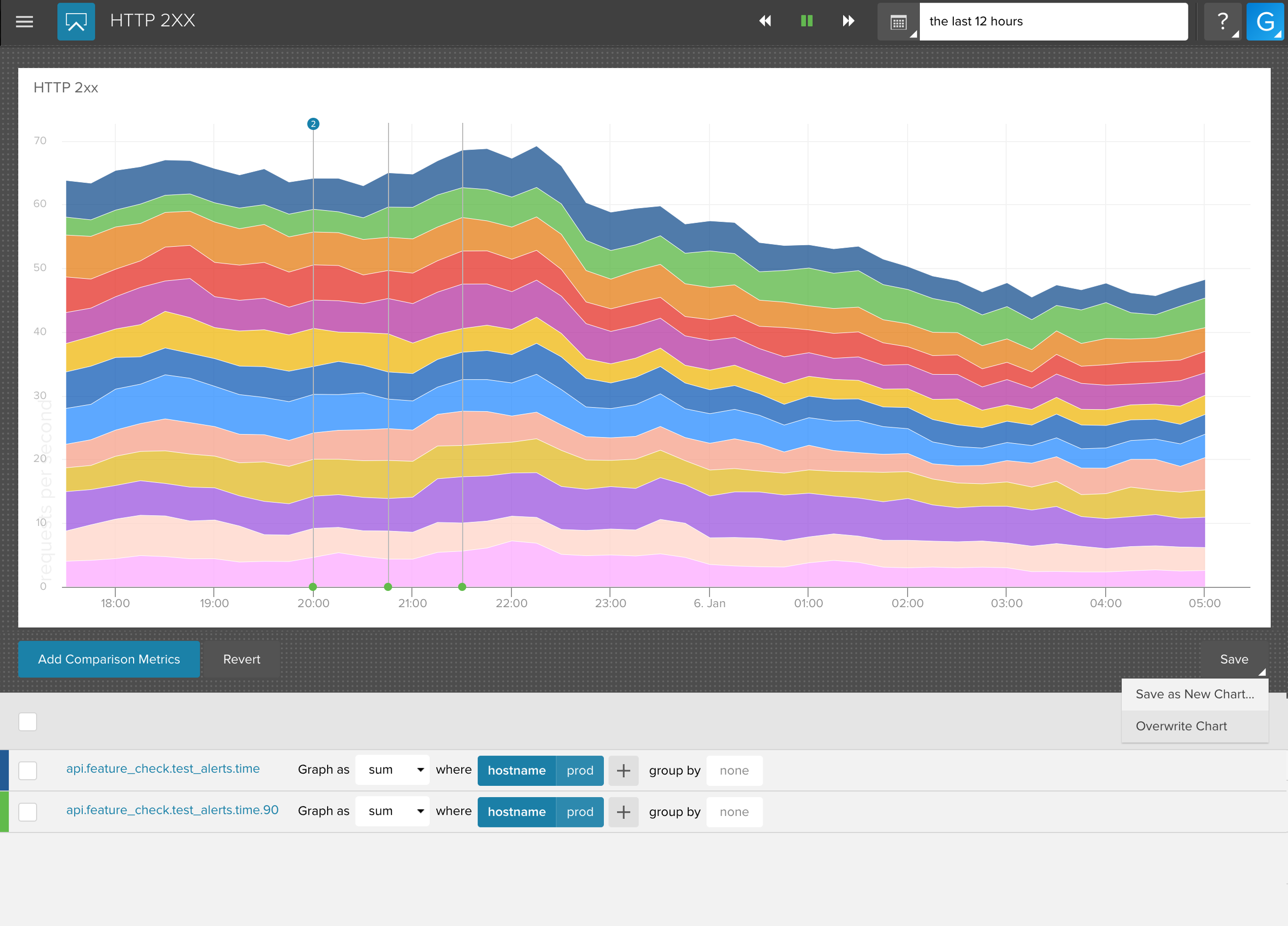
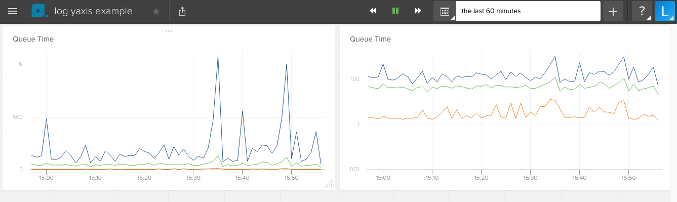
Chart Attributes & Log Y-Axis
The chart attributes allow you to set a title, a y-axis label, set the minimum and maximum values for the y-axis, and link the chart to another space.
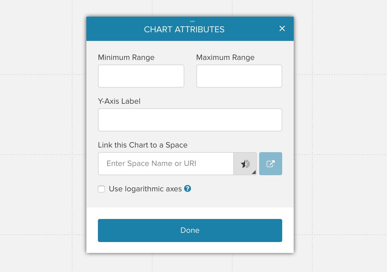
The chart attributes also provide the option to utilize a logarithmic scale instead of a linear scale. Logarithmic scales make it easy to compare values that cover a large range.
Snapshot
Create a permalink to an image of the chart or post it into your favorite chat agent. Read more in the Snapshots article.
Embed Chart
Please read the Embedded Charts article to learn about embedding charts in your site or application.
Copy Chart
We’ve all been there: you have created a beautiful chart. It is awesome. Now you need to create another chart that is similar but not quite the same, so take advantage of Copy Charts which allows you to copy individual charts inside or across Spaces. This makes building similar charts much easier and makes transferring views across Spaces super convenient.
To get started, select copy from the menu of your chart:
If you want, you can give the cloned chart a different name before copying. You may also copy charts to other Spaces:
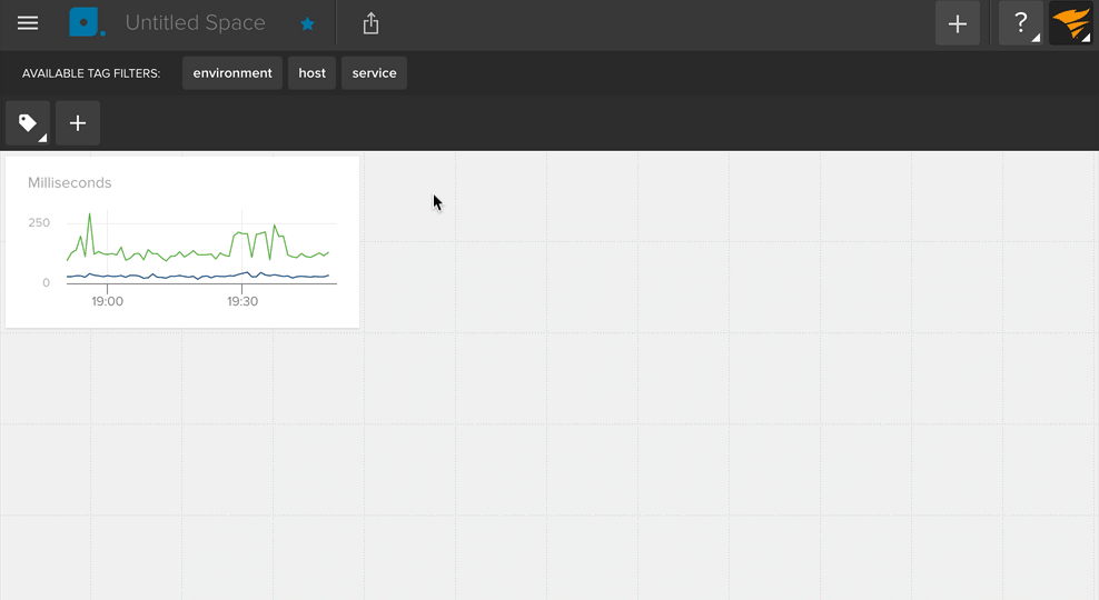
Chart Tooltip
When you hover over a chart, a tooltip appears that shows you values for each metric in the chart. In the tooltip, you can sort the metrics by size and name, and even filter the series based on a matching tag set.