
Usage
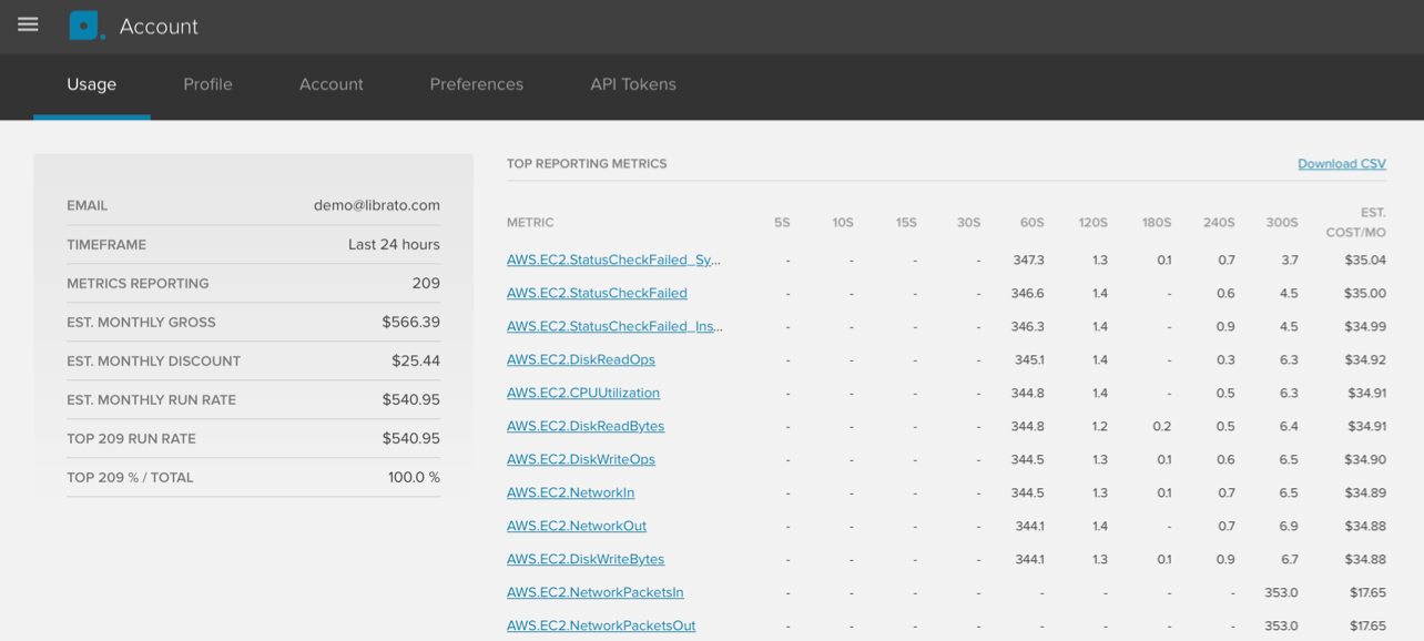
The account usage page gives you a snapshot of your current usage. The report looks at the past 24 hours and lists the top 500 metrics ordered by contribution to the overall cost.
Here’s an explanation of column headers of the table:
| Header | Explanation |
|---|---|
| METRIC | Shows the metric name. If you click on it, it will take you to the metric detail chart. |
| 5S, 10S … 300s | This is the resolution of the metric. For example, if you see 347.3 in the 60S column,
that means that the metric was reporting on average 347.3 individual data streams at
60s resolution during the past 24h. The reason you may see a fraction of a number is
because during the 24h window in which the report was generated you may have added or
removed streams.
|
| EST. COST/MO | Shows the impact of the metric on the overall cost. |
Use the “Download CSV” link to download a csv file of this report.
The table on the left shows a summary:
| Line item | Explanation |
|---|---|
| Your account email. | |
| TIMEFRAME | The report always looks at the last 24 hours |
| METRICS REPORTING | Active metrics seen in the past 24 hours. |
| EST. MONTHLY GROSS | Total cost of all active metrics seen in the past 24 hours. |
| EST. MONTHLY DISCOUNT | If your bill is over $400, we apply a volume discount. |
| EST. MONTHLY RUN RATE | The run rate is calculated by extrapolating the values from the 24h report to a
whole billing period (one month) to give you a sense of what your bill would look
like at the current data volume.
|
| TOP XXX RUN RATE | If you have more than 500 metrics, it shows the top 500 metrics’ contribution
to the total bill in $.
|
| TOP XXX % | If you have more than 500 metrics, it shows the top 500 metrics’ contribution
to the total bill in %.
|